Midnight Munchies
A speculative baking companion app that surfaces what you need, when you need it.
UI/UX Design
Role
Solo UI/UX Designer
Timeline
1 week - April 2026
Tools


Overview
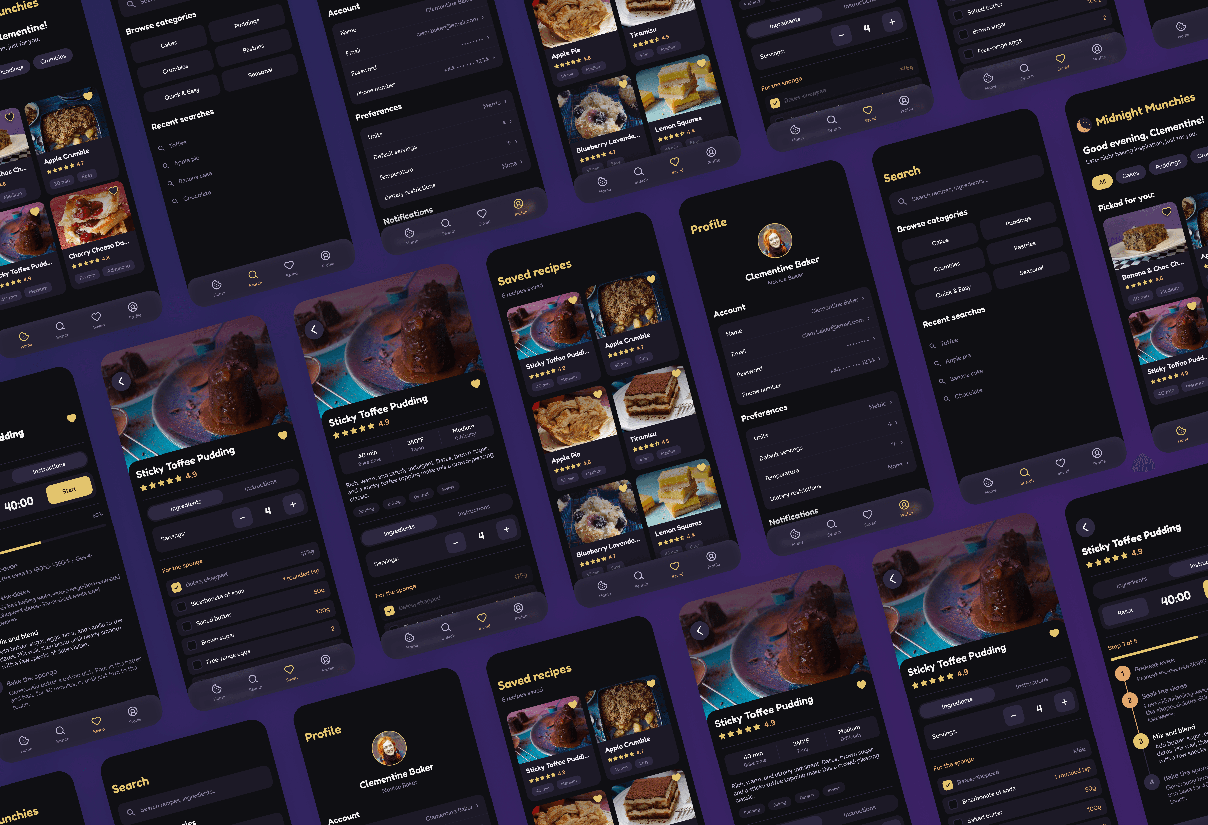
Midnight Munchies is a speculative baking companion app I designed to address a small but persistent friction in home baking: there's a lot going on in any given recipe, and almost none of it is useful at the exact moment you actually need to do something. The premise was simple. Build a focused mobile experience that gets out of your way once you're in the kitchen, hands covered in flour, trying to remember whether the next step calls for a quarter teaspoon or a half.
This was a school project, so the work centered on craft, prototyping, and design system thinking rather than market validation or shipped metrics. I built out the prototypes and a full UI kit in Figma, then took the demo implementation into Claude Code to bring it into a working environment.
Challenge
Recipes online are dense, often unnecessarily so. Long preambles, stock photography, ingredient backstories, and walls of paragraph instruction all compete for attention with the part you actually need: what to do, in what order, with what amounts. For someone in the middle of a bake, with sticky fingers and a timer running, scrolling through padding to find the next instruction is more than a minor annoyance. It interrupts flow, increases the chance of error, and turns a relaxing activity into a chaotic one.
I wanted to design a baking experience that respected the context of use, particularly the moments when the user has the least patience for visual noise.
Process
The work started in Figma. Before designing any specific screen, I worked through the interaction model for the hide and reveal behavior, since that was the central design move and everything else would need to support it. Prototypes let me test how the transition felt across different scroll positions and content states without committing to a final visual treatment.
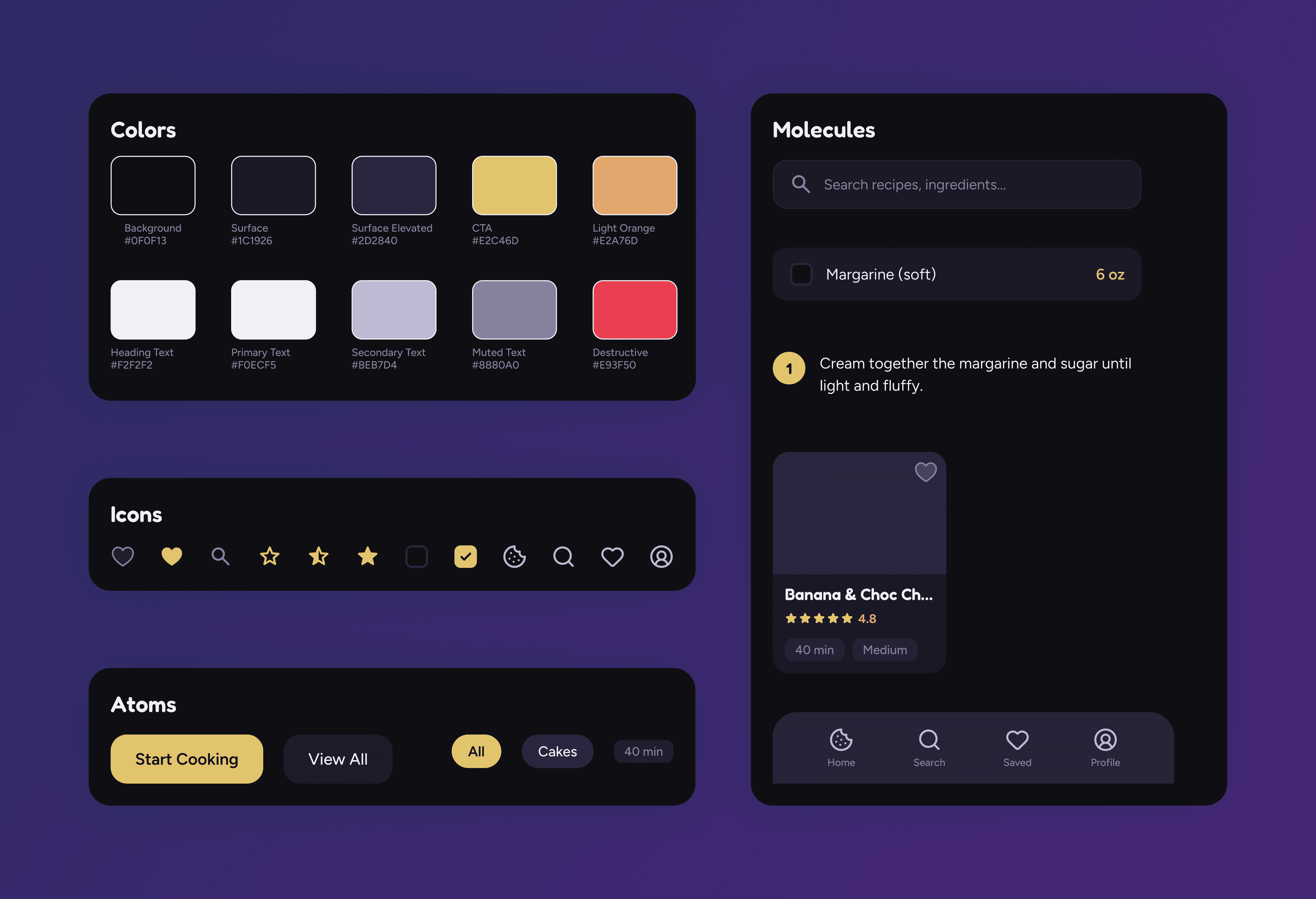
Alongside the prototypes, I built out a UI kit so the components, type scale, color tokens, and spacing rules were defined and reusable across the project. This made the design easier to iterate on as the prototype matured, and gave me a clean foundation to hand into the build stage.
For the working demo, I took the Figma design into Claude Code. My reasoning for this is that I wanted features that actually worked. The servings incrementor is the clearest example. In Figma, number variables can't do math, which means a serving scaler can only ever be a visual placeholder. In code, it's a real interaction that recalculates every quantity in the ingredient list on the fly. Building in Claude Code also opened the door to features that wouldn't have made sense to fake.
Solution
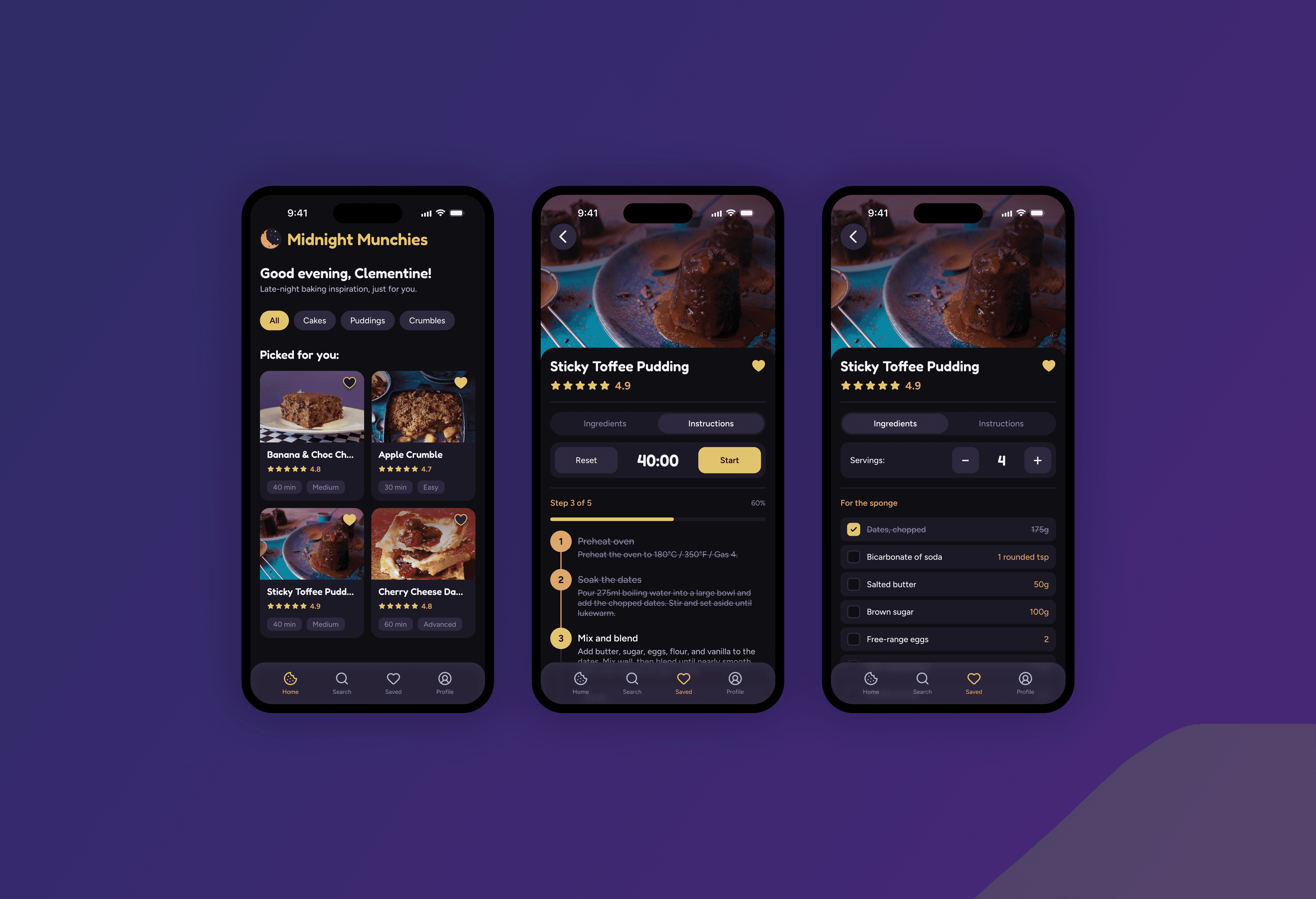
The final design strips the recipe view down to the two things that matter mid-bake: ingredients and instructions. Everything else recedes when it isn't needed.
Hide and reveal scroll behavior: Imagery, descriptions, and contextual content quietly disappear as you scroll up in the detailed view, leaving the working surface uncluttered.
Dynamic ingredients list: Servings can be incremented or decremented, and every quantity in the list scales accordingly, removing the need for mental math while you're working.
Interactive step checklist: Instructions function as tappable, trackable items so the user always knows where they are in the recipe and what comes next.
Focused visual hierarchy: When content does appear, it's organized to support quick scanning rather than continuous reading, with strong typographic contrast and generous spacing.
A working interactive demo: The final build is a real, navigable version of the experience, with the hide and reveal behavior working as intended.
Results
Because Midnight Munchies is a speculative project, there are no usage metrics to point to. What I can speak to is what the design is built to deliver.
The biggest expected impact is a meaningful reduction in cognitive load during the act of baking. By stripping the interface down to the two most essential elements (ingredients and steps) at the exact moment the user needs them, the design supports flow rather than fighting it. The dynamic serving scaler quietly removes a recurring source of error in home baking. The interactive checklist keeps the user oriented even if they look away from the phone for a few minutes to manage the oven or wash a bowl.
For me, this project was an exercise in restraint. The challenge was about deciding what could be hidden, when, and why, truly keeping the user top of mind, and meeting them where they're at. That discipline shaped both the prototypes in Figma and the working build, and it's a constraint I'd carry into anything I'd want to design next.