Haunted Social
A conceptual social platform built around intentional presence and curation.
UI/UX Design

Role
Solo Designer and Developer
Timeline
~1 week
Tools


Overview
I grew up on the old internet. MySpace profiles, guestbooks, visitor counters. The early 2000's web was chaotic and half the profiles were unreadable. But it had a certain type of charm that's sadly missing from modern social media; the ability to make a profile that was truly a reflection of you.
Haunted Social is a speculative concept meant to address this. What would a social platform look like if it combined the collecting utility of Pinterest, the customizability and sense of place found on Myspace and Tumblr, ditched the addictive endless scroll, but left just enough structure in place to ensure accessibility?
Challenge
In order to break away from the addictive patterns of modern social media, the defining decisions in this project were mostly refusals. Every pattern I would normally reach for in a modern social product; i.e. badge count, algorithmic feed, endless scrolls; exist to keep people locked in. Sponsored ads and data collection make the experience feel predatory. I had to find a way to reject all of these while still making the app worthwhile to engage in.
The second problem was customization. The existence of MySpace and Tumblr proved people want to express themselves, and there's a very good reason these have seen a recent resurgence. But I've also seen the unreadable chaos that ensues when you give people complete freedom over their profile. I wanted the personality without the chaos, which meant deciding exactly how much of a profile its owner gets to touch.
Research
I starting by doing competitive analysis by going back through the platforms that made the old internet profiles feel like a "place". Then I looked at what people actually do on modern platforms when nobody is pushing them. This actually lead me to Pinterest, which gave me the collecting model.
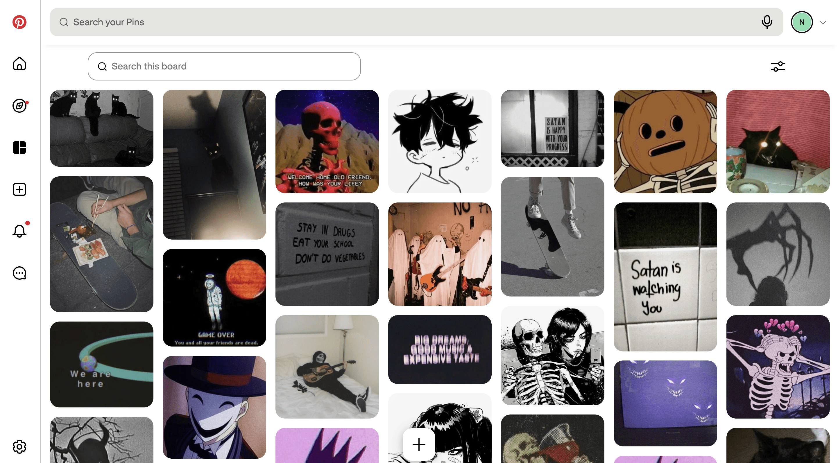
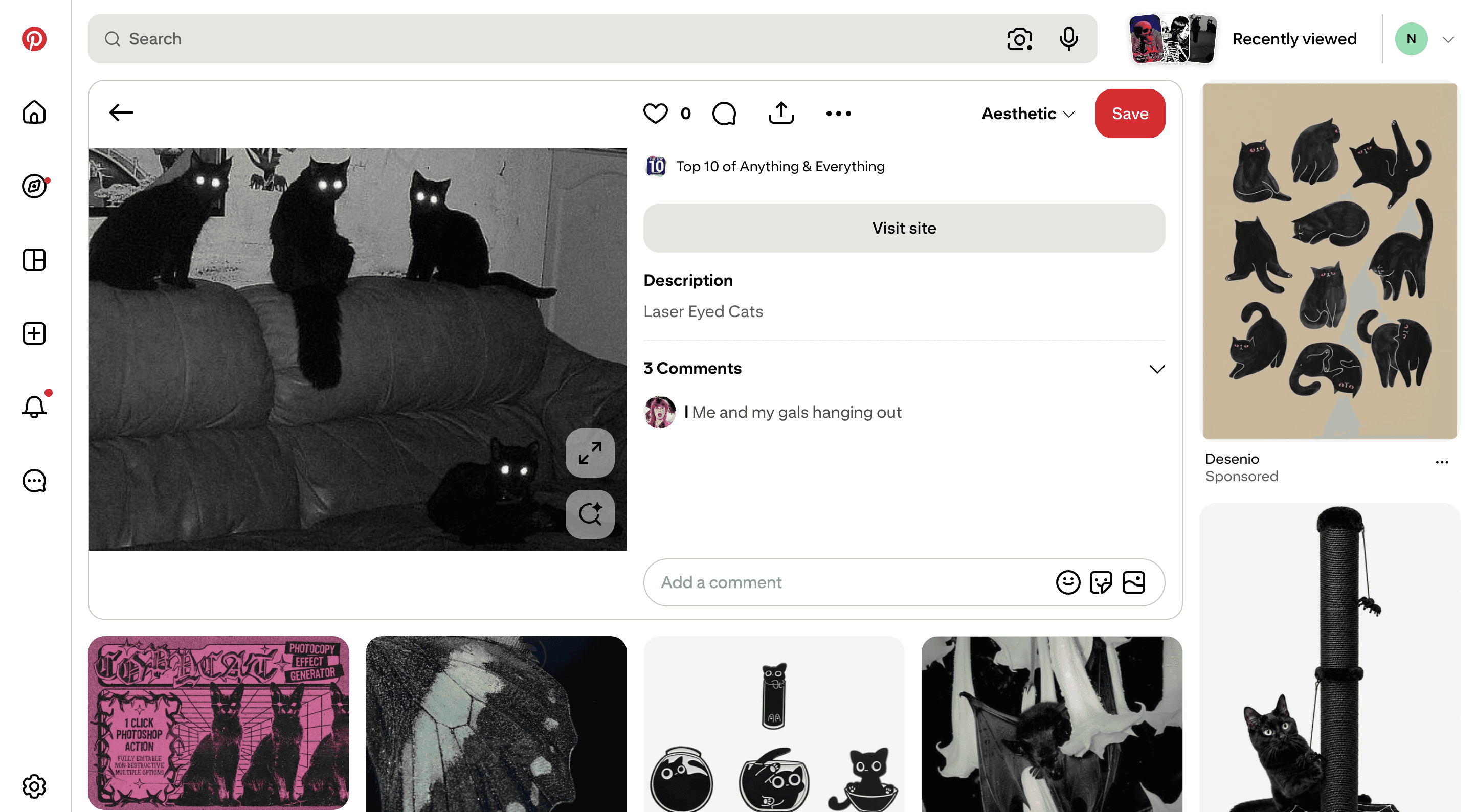
Organizing your own taste is the whole point, and it still has merit even when no one is watching. This then helped point me back again to Tumblr and reminded me of the early reblog-era curation culture, where people were watching.
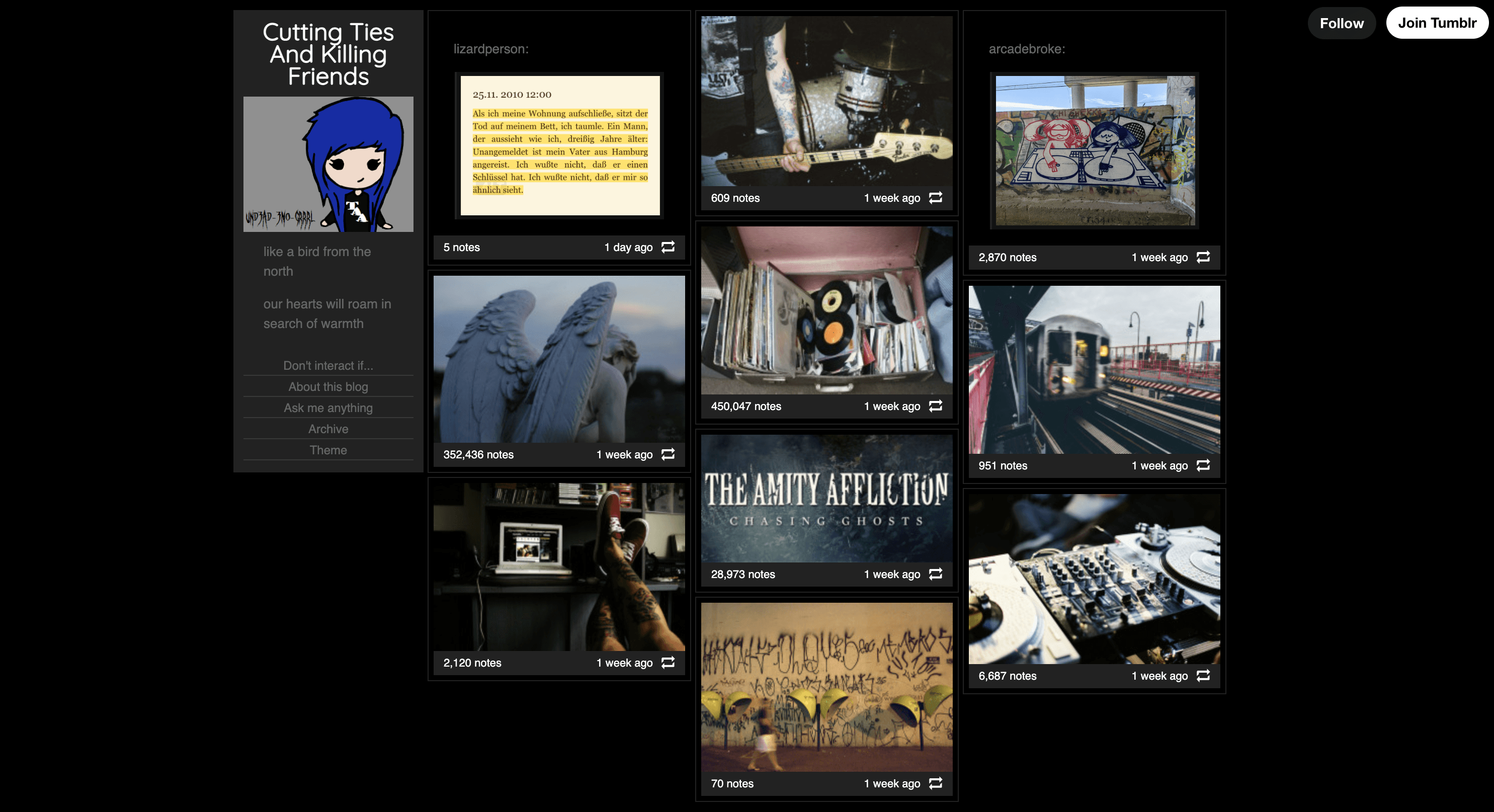
I also l looked at SpaceHey, a modern re-imagining of old MySpace. SpaceHey isn't about collections of content, it focuses more on information about the user and curating the profile itself. But people naturally shared all kinds of interests anyway, from music to movies to books, even gifs they like.

I noticed curation was the common them between all these sites, and it was working well for all of them. Pinterest had the clearest visual hierarchy, because it took this out of user's control, but even Tumblr and SpaceHey had some recurring patterns regarding how users were naturally choosing to organize and style their pages.
Eventually I landed on the idea of a profile acting as a portrait of what someone likes rather than a log of what they did.
Process
After research, it became clear curation would be the main focus of this application, so I skipped the usual starting point and wireframed the detailed collection page first.
I drew on Pinterest again for the general structure, but the concept of "pins" felt too derivative. So I started thinking about the other ways people collect the things they like, and because I'm a huge fan of film photography and poloroids, I immediately thought of photographs. What if a collection felt a bit more like a scrappy journal full of snapshots?
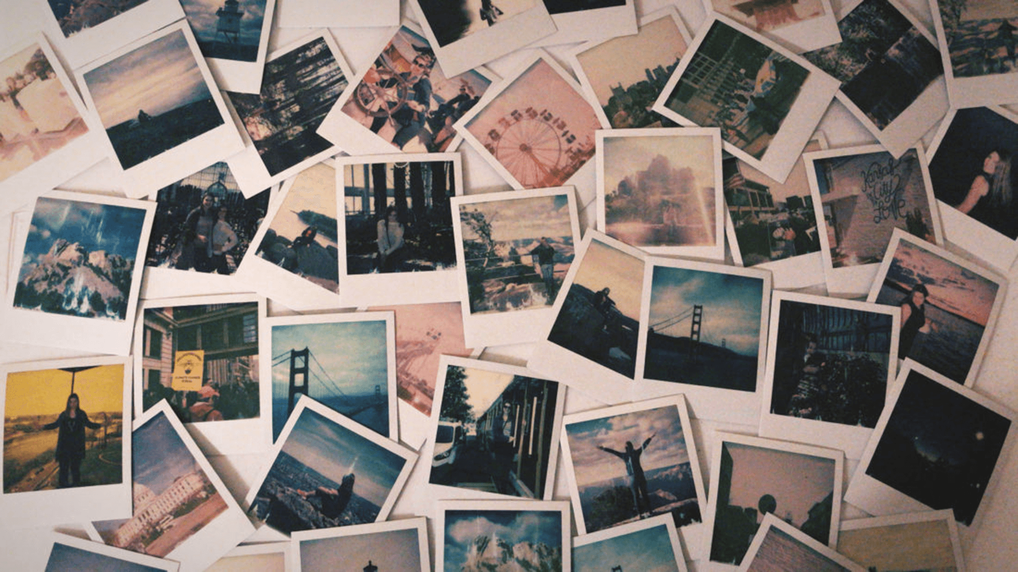
Once this idea came to me the aesthetic choices quickly followed. I gave every snapshot a slight randomized tilt so a wall of them never looks machine-aligned, and I found I liked the look of adding a bit of tape at the top of each one for a hand-made feel.

I also spent time imagining my ideal user and what their collections might look like. I wanted the demo to feel real, so I actually spent time curated the demo content myself.
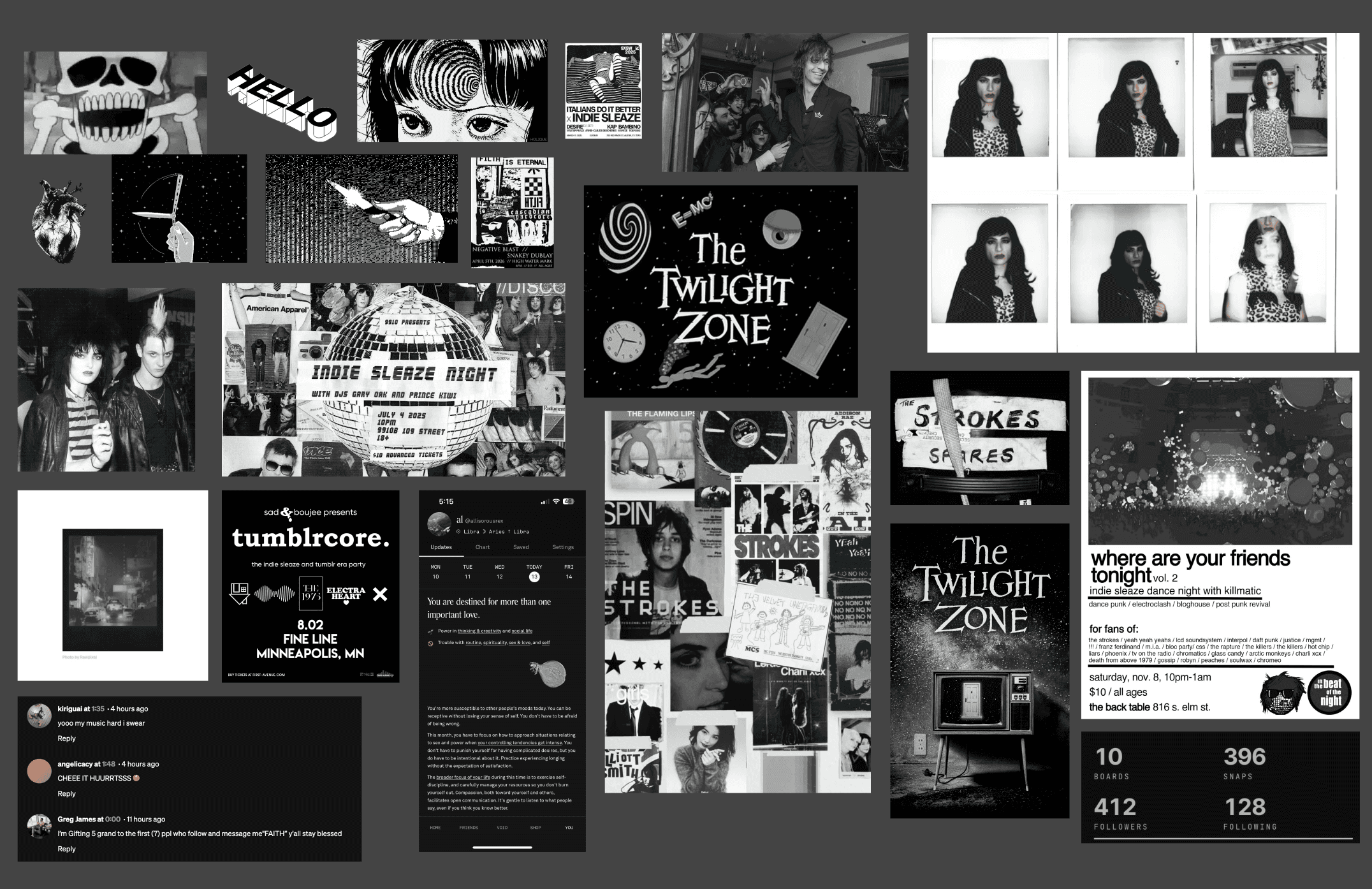
It was a lot of fun, and ironically helped proved the value of the platform before a single line of it was coded. I happily lost hours to collecting things I liked.
From there I moved to the profile page, and I worked through it as a set of questions. What would a user want to know about a collection before opening it? What would they want to know about the person behind the profile?
The name Haunted Social came to me mid development. I was thinking about how old social media is "dead" but making its way back, like a friendly welcome spirit. I also thought about how people call the bars and places they like to frequent their local "haunts," and how that is the exact feeling I wanted this platform to provoke. Once the name landed, the iconography, copy, and voice snapped into place.
Solution
Since the platform is only for demo purposes (I don't have the bandwidth to handle the legalities of shipping a real social media site solo) it is a deliberately serverless static site hosted on S3.
As far as the concept goes, the solution is a genuinely engaging platform where users can curate their own personal collections and share a part of themselves with others, on their own terms.
Outcome
Haunted Social is a self-initiated concept, and I am presenting it as exactly that. There is no user base and no engagement data, which is fitting for a platform whose success metric would never be engagement anyway.
If I took it further, I would first need to imagine additional pages in the workflow. What does curation actually look like in practice? How does a user add new collections, or add to existing collections? What does it look like to search profiles and snapshots?
Once I had a clearer picture, I would need to measure it against its own philosophy. Do people return on their own schedule? Retention without compulsion is the goal, and I have no doubts I would achive that.


